Pinterest Picks

Wednesday, 12 November 2014 •

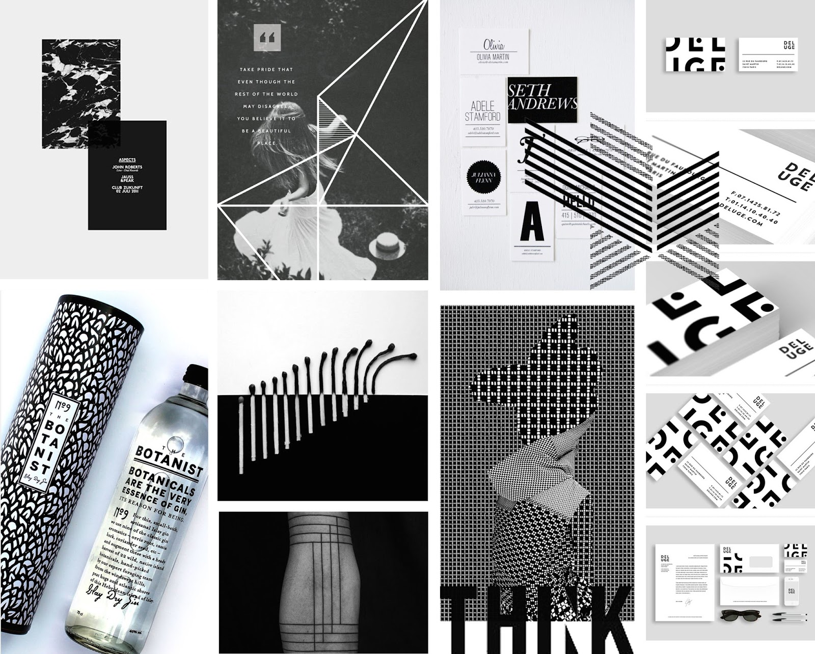
Focusing on B&W, these images hold that quality and add dynamic and energy without the vibrancy of colour.

Marble has began to make a come back in interior recently and the use of an inverted style, utilising more dark than light, as shown by the image top left, looks eye catching and stunning. Paired with a black page and a lot of negative space, it really stands out and commands the page.

The Botanist bottle is simple, focusing on typography. It's counterpart, the sleeve it comes in, features a bold pattern which leaves a lasting impression with the bottle.

The use of contrasting patterns as seen on the bottom line, third along, is both an eye sore and visually stunning: it's a perfect balance.

| 1 | 2 | 3 | 4 | 5 | 6 | 7 | 8 | 9 | 10 |

Moodboard: Great British Meat Co.

Saturday, 8 November 2014 •


With this brief, something the clients mentioned was that they didn't want to be advertised as "gourmet" -- they didn't want to be associated with the branding of places such as M&S. With that in mind, I want to experiment with rustic, traditional branding. I also feel it is necessary to focus on is their name: "the Great British Meat Company." With emphasis on the place where they come from, this company believes it's important to know where your food is reared. Believing that the best meat on the planet is born and bred in Britain, these butchers endorse learning about welfare, provenance and traceability. I wanted to replicate these beliefs in the moodboard. They are witty, "because only fools eat hoses, knowing where your meat comes from isn't just important, it's essential." and easily accessible, due to being a personal online butcher, delivering high quality for good prices to your home. Though not a huge meat eater myself, I'm incredibly picky and definitely do care about where my food comes from -- and due to this, my interest in this brief has suddenly peaked. I think they stand for something great and being quite open and fun, I feel I have a lot of room to experiment with this brand.

Moodboard: Music Futures Conference

Thursday, 6 November 2014 •


I found this moodboard particularly difficult to create, due to the many different directions I could take with this brief. Due to the subject matter "music futures" I wanted my approach to be focused on trends both old and new in the way we listen to music. One common factor is obviously soundwaves, so i threw them in as the groundwork I can build from. The conference's current logo is very vibrant, the letters opague and overlapping each other. One idea I have for this company is to make the logo more fluid, to animate it a little more whilst focusing more on the movement of colours than the structure of the letters. I definitely want to keep the brightness of the colours, as I think it's quite fun and counteracts what I personally think when I hear the word "conference" (business men, suits, formal.)

Moodboard: Bedrock UK

Wednesday, 5 November 2014 •


Creating album artwork for a band whose style is described as the contrast between light and dark, and "brimming with tough, punchy techno, featuring the occasional moment of blissful electronica." I want to focus on creating something visually striking, highlighting the contrast -- possibly a collage of images focusing on modern and fundamentalism, but also a hint of nostalgia too. I love the idea of placing furniture on the page, with an image escaping -- and also want to experiment with traditional methods such as acrylic paint and drawings, whilst using digital to sharpen it towards the end. It needs to be charismatic, lively, and truly encapsulate the music in one image. I'm pretty excited to develop this more, I think this brief has so many opportunities and gives me quite a lot of creative freedom to really put my skills to the test!

Pinterest Picks


This month featured all things green and grey. A current trend i've been seeing often within both fashion and design is the different leaf prints -- though formally seeing florals, the focus has turned to the vibrant leaves and stems of the plant. They are delicate and detailed with their veins and the bright shades of green are compelling.

Bottom middle features a lovely sign: the use of underlines is something I've never thought about using in my work, and this paired with the structural sans-serif typography just works.

Finally, I was drawn to the image bottom right of the page due to the photorealistic illustrations used. Many have began to revisit this old textbook style of imagery and I am loving it.

| 1 | 2 | 3 | 4 | 5 | 6 | 7 | 8 |

Moodboard: Entrepreneur's Forum

Saturday, 1 November 2014 •


This moodboard is for a brochure for a conference held by the Entrepreneur's Forum. I wanted to draw inspiration from the definition of an entrepreneur, "a person who sets up a business or businesses, taking on financial risks in the hope of profit." Exploring the idea of success, risks, freedom, and finding a balance between. They inspire, connect and share knowledge with one another to help a business' growth and success, and create a dynamic environment that nurtures emerging talent. As the North East of England has the highest rate of unemployment, it's incredibly important to have such a practice helping to create jobs and opportunities in the area, and I want to stress that through their brand. I want to create something that shows strength, knowledge and stresses the need for a helping hand. I also want to create something fun, and bright to counteract their current website and branding. I must admit I'm excited to explore these ideas in more depth.

Moodboard: Donkey Label

Thursday, 30 October 2014 •


When given the brief of designing a jersey for the cycling company, Donkey Label, I decided the approach I wanted to take was one that focused on the human body. After speaking to someone from the target audience, (Hello Dad!) there were some great points made: needs to be reflective, bright, 3 pockets on the back -- one with a zip, needs to fit the three f's, form, fullfilling and functional. I felt he was a great person to speak to as he has often taken up challenges that push his body to a limit: cycling from Gibraltar to Newcastle Upon Tyne, and also competing in Race Across America, he has a lot of experience and is particularly picky on what looks good, feels good, and functions to his standards. He mentioned a comment about how cycling allows you to be one with nature, to see the world in a different way, quicker than walking but more accessible than a car. I wanted to do something that combined the two. I decided that, after looking at the effects of cycling on the body, both good and bad, I wanted to create a jersey that signified the topography of the human body. The moodboard above focuses on the notes I took from the interview: reflections, nature, topography -- a modern approach to a traditional sport. I personally feel this could allow me to utilize texture and colour, experiment with touchpoints and materials and create something significant. Here's to taking inspiration from something you know pretty darn well, your home, the body!
Pinterest Picks

Wednesday, 29 October 2014 •


Here I have shown some of my most recent likes from Pinterest. I discovered Leslie David's work, as seen top middle, and was extremely inspired by her use of texture and colour to use a traditional method of painting on top of a photograph. It's the perfect mixture of realistic and nonsensical and adds a touch of surrealism to the page. I was also drawn to the poster featured bottom left, which is simplistic and organised.

The quote to the middle is something I want to remember throughout this year, within my coursework and also my life.


1 | 2 | 3 | 4 | 5 | 6 | 7 | 8 | 9