Pinterest Picks

Wednesday, 29 April 2015 •


Something I am currently loving, from my research of my D&AD entry, is all things natural. This pinterest pin board is inspired by nature and natural resources. Something quite focal in the fashion industry currently is a new take on floral: leaf prints, instead of flower prints. It's fresh and the green hues are quite charismatic, especially when paired with bright colours as the image to the right is. Brush typography has also become something that catches my eye, no matter what context it is used. Over summer I would love to experiment with my own brush typography and get slightly better: an idea is to create one typography piece a day.
Eco friendly material is extremely big recently, especially those featuring brown packaging. It's raw and intimate and looks great paired with almost everything. This was a huge inspiration for my D&AD entry.

| 1 | 2 | 3 | 4 | 5 | 6 | 7 | 8 |

Pinterest Picks.

Thursday, 12 March 2015 •


The top middle image, featuring the dynamic flower packaging from Blomrum, shows the companies innovation. I think the brown packaging is on trend and is a really simple way of carrying flowers to their destination safely.

Recently I have been really into typewriter fonts paired with sans serif fonts, as seen in the bottom middle image. Madewell have quite a visually stunning brand.

Finally, the bourbon bottle to the right of the image is charismatic and utilising it's namesake within the bottle, using constellations as a decoration.


| 1 | 2 | 3 | 4 | 5 | 6 |

Pinterest Picks

Wednesday, 18 February 2015 •


My most recent Pinterest Picks have all featured navy. I go through phases with colour palettes and at the minute, I am really digging this.

In my first module this year, I created a new cycling jersey design for Donkey Label. I was inspired by topography and cartography, introducing the linear aspects of maps to the jersey. Looking at the middle business cards, which features a similar linear pattern, I do wish I had continued to expand my own into a final outcome. I think over my summer break I might do this.

Using typography as furniture to a page to add energy and a new dimension to the layout, as seen in the top left editorial piece is really compelling and something I would like to experiment with in the future.

Finally, the bottom right image, Cos use such a subtle and simplistic logo, embossed into the business cards. Paired with a simple colour palette, and a beautiful typeface, the brand is pretty great.

| 1 | 2 | 3 | 4 | 5 | 6 |

Pinterest Picks

Wednesday, 12 November 2014 •

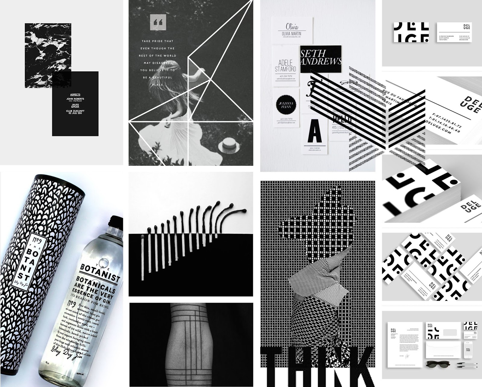
Focusing on B&W, these images hold that quality and add dynamic and energy without the vibrancy of colour.

Marble has began to make a come back in interior recently and the use of an inverted style, utilising more dark than light, as shown by the image top left, looks eye catching and stunning. Paired with a black page and a lot of negative space, it really stands out and commands the page.

The Botanist bottle is simple, focusing on typography. It's counterpart, the sleeve it comes in, features a bold pattern which leaves a lasting impression with the bottle.

The use of contrasting patterns as seen on the bottom line, third along, is both an eye sore and visually stunning: it's a perfect balance.

| 1 | 2 | 3 | 4 | 5 | 6 | 7 | 8 | 9 | 10 |

Pinterest Picks

Wednesday, 5 November 2014 •


This month featured all things green and grey. A current trend i've been seeing often within both fashion and design is the different leaf prints -- though formally seeing florals, the focus has turned to the vibrant leaves and stems of the plant. They are delicate and detailed with their veins and the bright shades of green are compelling.

Bottom middle features a lovely sign: the use of underlines is something I've never thought about using in my work, and this paired with the structural sans-serif typography just works.

Finally, I was drawn to the image bottom right of the page due to the photorealistic illustrations used. Many have began to revisit this old textbook style of imagery and I am loving it.

| 1 | 2 | 3 | 4 | 5 | 6 | 7 | 8 |

Pinterest Picks

Wednesday, 29 October 2014 •


Here I have shown some of my most recent likes from Pinterest. I discovered Leslie David's work, as seen top middle, and was extremely inspired by her use of texture and colour to use a traditional method of painting on top of a photograph. It's the perfect mixture of realistic and nonsensical and adds a touch of surrealism to the page. I was also drawn to the poster featured bottom left, which is simplistic and organised.

The quote to the middle is something I want to remember throughout this year, within my coursework and also my life.


1 | 2 | 3 | 4 | 5 | 6 | 7 | 8 | 9