Pinterest Picks

Wednesday, 12 November 2014 •

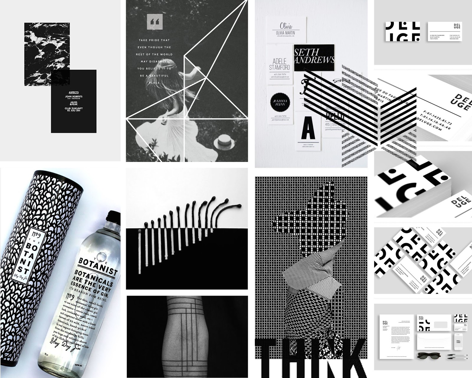
Focusing on B&W, these images hold that quality and add dynamic and energy without the vibrancy of colour.

Marble has began to make a come back in interior recently and the use of an inverted style, utilising more dark than light, as shown by the image top left, looks eye catching and stunning. Paired with a black page and a lot of negative space, it really stands out and commands the page.

The Botanist bottle is simple, focusing on typography. It's counterpart, the sleeve it comes in, features a bold pattern which leaves a lasting impression with the bottle.

The use of contrasting patterns as seen on the bottom line, third along, is both an eye sore and visually stunning: it's a perfect balance.

| 1 | 2 | 3 | 4 | 5 | 6 | 7 | 8 | 9 | 10 |

Work Based Learning Evaluation.

Within this module I was required to create five sketchbooks on different briefs within five weeks. My sketchbook work before this module was quite weak as I am a perfectionist and I didn’t like to work in a medium without the option of deleting and rearranging. Before this module I undertook a SWOT analysis, which allowed me to outline my goals from the module. 

I wanted to experiment with my sketchbooks and create something quite different to what I am used to. Using means such as collage and illustration, alongside researching via different mediums such as books and magazines has aided me to generate a good body of work. 
Before this module, I relied heavily on the likes of Pinterest to research and find inspiration upon. During this module, I explored different websites such as Behance, Designspiration, ThisIsCollate and CargoCollective which enhanced the inspiration and influence I was finding. I want to continue this throughout the year. 

Rewriting the briefs and highlighting aspects which appear predominant and dynamic allowed me to really focus on certain features which in turn aided my work tremendously: this is something I have really lacked within my workings out. I often push the brief aside when I believe I have an understanding, but I have found in this module that revisiting the brief allows you to consider new aspects, refocus your attitude and reevaluate what you are trying to achieve. This is something I will continue to do in projects ahead. 

One area I found difficult was time management. In previous projects I have found my time management to be quite variable, working well for some briefs and finding difficulty with others. With this brief, I found myself working too heavily on one project and uninterested in another. Within the industry I will be given briefs I may not enjoy, but I will need to focus on each fairly. This was a great learning curve for me and I believe I have a greater understanding on the balance I will need to create a consistent body of work. 

I am happy with the body of work I produced. Scrapping my perfectionism, I allowed my workings out to be created on paper and I feel my work has enhanced due to this. Allowing myself to scribble a consciousness of thoughts as and when they happen, rather than annotating after allowed my ideas to be generated then and there and was beneficial to my work. 

Profile: Craig & Karl

Tuesday, 11 November 2014 •

"There’s no conscious decision to head towards one thing or another, it’s just our personalities loosely guiding us in a direction."

Craig & Karl are quite unique in their ways. Their collaborations are transatlantic, with Karl Maier living in London, and Craig Redman living in New York, the two battle miles and timezones to create their work. Despite this, they have become hugely successful pop culture illustrators, working on fashion, art and media projects with bright colours and humour.

Craig & Karl are a great example of how the internet has changed the design world. As mentioned in the talk I attended by Founded, with the invention of pdf's and the internet, studios are no longer restricted to regions. Illustrating this, the two make their collaboration work via the use of online messaging and video programs such as skype. Often they manage different projects, and check in frequently with one another to discuss ideas and feedback. They are both heavily involved in the projects together, stating, "we know who is best suited to each part of a project so we are able to quickly delegate tasks and organize our schedules. It works because we know each other well and we listen to and respect each other’s opinions."


Growing up on the east coast of Australia, they met during their first year at Art College. During that time they worked on any college project, that they were permitted to, together. They became largely considered as a singular entity by friends, family, and professors, and believe that it would have been more surprising if they hadn't have continued to collaborate after college also. Though sacrificing a lot of the spontaneity that came from real life interactions together, the two believe there aren't many negatives to living in separate cities: being present and engaged in both has aided their work.


Both Craig and Karl share a similar aesthetic, though there are stylistic elements that are particular to the person. Influencing each other, the work they produce is of a recognisable style, and they strive to create a visual language that is unique to them as a duo. With bold, colourful and quite pop-arty illustrations, Karl describes their current influences are "pretty eclectic," naming artists such as David Hockney.


And it's quite clear what the two are producing is working for them, as they are high in demand. Recently featured in Vogue, Grand Designs, Little White Lies, Volkskrant, Bayerische Staatsoper, and the New York Magazine, one of their most famous pieces is the portrait of Barack Obama, following his win of a second term in government. They also describe it as one of their most significant projects, "the combination of the man, the moment and being on the cover made it very special." Some of their other projects have been collaborating with Le Specs, creating a sculpture of Michelangelo Antonioni, the 72dp mural, a huge, colourful transformation of an underground car park, skateboards, and Neon Lane, a permanent light installation in Melbourne.


They are also working on brand collaborations, a range of bags with MCM, a gig poster for the XX and a capsule clothing collection for Kid Robot. They were also chosen this year as Kiehl's annual artist collaboration, where their signature bold designs can be seen on gift boxes.

Karl's advice for Graphic Designers to remember is "you can't polish a turd." You can see more of the duo here, here, here, and here.

Recently

Sunday, 9 November 2014 •


Sketchbooks have never been my forte: I thought it would be my nightmare having been given a brief that was solely sketchbook work. But I admit I have enjoyed it more than I thought I would, and I really think I needed to just focus on my thoughts and ideas, ignoring the frustration I feel over layouts and cutting straight lines and handwriting. Here is what I've been up to recently, the pieces I created mood boards for.

Within this module I was required to create five sketchbooks on different briefs within five weeks. My sketchbook work before this module was quite weak as I am a perfectionist and I didn’t like to work in a medium without the option of deleting and rearranging. Before this module I undertook a SWOT analysis, which allowed me to outline my goals from the module.

I wanted to experiment with my sketchbooks and create something quite different to what I am used to. Using means such as collage and illustration, alongside researching via different mediums such as books and magazines has aided me to generate a good body of work.

Before this module, I relied heavily on the likes of Pinterest to research and find inspiration upon. During this module, I explored different websites such as Behance, Designspiration, ThisIsCollate and CargoCollective which enhanced the inspiration and influence I was finding. I want to continue this throughout the year.

Rewriting the briefs and highlighting aspects which appear predominant and dynamic allowed me to really focus on certain features which in turn aided my work tremendously: this is something I have really lacked within my workings out. I often push the brief aside when I believe I have an understanding, but I have found in this module that revisiting the brief allows you to consider new aspects, refocus your attitude and reevaluate what you are trying to achieve. This is something I will continue to do in projects ahead.

One area I found difficult was time management. In previous projects I have found my time management to be quite variable, working well for some briefs and finding difficulty with others. With this brief, I found myself working too heavily on one project and uninterested in another. Within the industry I will be given briefs I may not enjoy, but I will need to focus on each fairly. This was a great learning curve for me and I believe I have a greater understanding on the balance I will need to create a consistent body of work.

I am happy with the body of work I produced. Scrapping my perfectionism, I allowed my workings out to be created on paper and I feel my work has enhanced due to this. Allowing myself to scribble a consciousness of thoughts as and when they happen, rather than annotating after allowed my ideas to be generated then and there and was beneficial to my work.

Moodboard: Great British Meat Co.

Saturday, 8 November 2014 •


With this brief, something the clients mentioned was that they didn't want to be advertised as "gourmet" -- they didn't want to be associated with the branding of places such as M&S. With that in mind, I want to experiment with rustic, traditional branding. I also feel it is necessary to focus on is their name: "the Great British Meat Company." With emphasis on the place where they come from, this company believes it's important to know where your food is reared. Believing that the best meat on the planet is born and bred in Britain, these butchers endorse learning about welfare, provenance and traceability. I wanted to replicate these beliefs in the moodboard. They are witty, "because only fools eat hoses, knowing where your meat comes from isn't just important, it's essential." and easily accessible, due to being a personal online butcher, delivering high quality for good prices to your home. Though not a huge meat eater myself, I'm incredibly picky and definitely do care about where my food comes from -- and due to this, my interest in this brief has suddenly peaked. I think they stand for something great and being quite open and fun, I feel I have a lot of room to experiment with this brand.

Friday Favourites: Research

Friday, 7 November 2014 •

Something that is important in the design world is keeping up with current trends. There are so many ways to do this, from magazines to social media, it's become easy to find out what is going on and what others are doing. These are my favourite websites that I check often to keep me inspired.

Pinterest
I am a self confessed pinterest addict. With two accounts, one used solely for design inspirations, and the other used for every day life, this site is checked more often than I should admit. It can be extremely beneficial to research on, due to being able to keep everything in one place easily. Creating visual bookmarks, this website allows you to easily organise and collate your images in files, and keeps you up to date on what others are liking and doing.

Behance

Behance is the leading online platform to showcase and discover creative work. You can search certain words, and find what others are up to. This is a great platform to upload your portfolio to, as it's free, and it distributes to other online galleries, maximizing the exposure to your work. Many companies explore this website to access talent on a global scale, and therefore it can be extremely beneficial to a designer. Whilst Pinterest is great, you can only pin one image of the site, and it often goes uncredited. Behance has the option to look at full projects and works in progress, therefore it can be inspiring to look through: often, seeing work as a plan or a sketchbook, and see the experiments and thought process that got it to the final look. It also gives you the opportunity to look at the most appreciated work, which is great to see what is in demand and on trend currently.

Dribbble

Similar to Behance, Dribbble showcases a community of designers, from web, graphic, illustrators, icon artists, typographers and logo designers, amongst others, these creatives share their work, process and current projects. With a free account you can follow your favourite designers and teams, like and organize your favourite images, and send limited messaging to designers. What makes this platform different is that, with a pro account -- $20 a year, you can find and hire designers by location and skill and send unlimited messages to designers about work opportunities. This is a great platform to get onto if you are a designer -- though it requires an invitation from a member of the community. Something to aspire to, I guess! You can search through without an account and look at what others are creating, and you can also see "responses" from others full with constructive criticism.

On the bottom of the home page, Dribbble shows the current job opportunities going -- and you don't have to be on the website to apply for the positions.
Cargo Collective


Cargo Collective is also an exclusive website. Unlike Dribbble, you need not an invite, but to apply instead, answering a simple question of, "tell us about yourself and your work." The platform is a personal publishing platform, offering members free-standing websites, with a variety of customizable templates, control in the way content is displayed and an interface built entirely around your work. Though a great way to showcase your portfolio, it isn't this that interests me: the homepage acts as a gallery, collating what is popular, and highlighting some great pieces of work. When I first came across this website, I got lost scrolling for at least an hour. Each link on the gallery takes you to the artists website, where you can see other work. It's quite a great way to find artists and designers whose style inspires you.

The Jealous Curator

"There is one moment, in the first few seconds, when you look at a piece of art and know that you love it. It’s the moment when, if you’re an artist yourself, you look at it and feel a rush of uplifting inspiration… and total soul-crushing jealousy all at the same time. It’s when you walk away thinking, “Damn, I wish I thought of that.”" The Jealous Curator is another site that broadcasts artists and highlights their work. The author herself is a creative director, who decided to create a platform to feature art and design that has "made her jealous." And, after realising that jealousy can actually be turned completely on it's head and used inspiration, she began to use it as fuel to get back into the studio and create something. I've found a lot of incredible artists who have quickly become my favourites due to this site.

Designspiration


Designspiration is one of those sites you just can't help but love. I could scroll for hours through the website and never get bored. You can search colour schemes, or search by typing anywhere at anytime on the site, which is quite quirky. Being able to search through 5 colours of your choice is brilliant when creating a moodboard with a certain colour scheme. Designspiration describe themselves as "focused on maintaining a high level of great design inspiration to share around the world." And being a nudity-free environment, browsing at anytime, anywhere is safe -- so hey, get your designspiration on at work!

This Is Collate


Similar in layout to The Jealous Curator, This Is Collate is a great platform to explore new work by creatives. Featuring anything current, the website is a great platform to look at when needing a boost or a little motivation to kick you into gear. This is one that is raved about often by my lecturers, and I can totally understand why. I've found myself looking through the site when I'm feeling most uninspired: paired with a lot of white space and an underwhelming blog title, the emphasis is solely on the content itself.
Moodboard: Music Futures Conference

Thursday, 6 November 2014 •


I found this moodboard particularly difficult to create, due to the many different directions I could take with this brief. Due to the subject matter "music futures" I wanted my approach to be focused on trends both old and new in the way we listen to music. One common factor is obviously soundwaves, so i threw them in as the groundwork I can build from. The conference's current logo is very vibrant, the letters opague and overlapping each other. One idea I have for this company is to make the logo more fluid, to animate it a little more whilst focusing more on the movement of colours than the structure of the letters. I definitely want to keep the brightness of the colours, as I think it's quite fun and counteracts what I personally think when I hear the word "conference" (business men, suits, formal.)