Editorial design, as I'm sure I've mentioned before, is my favourite area of design. I enjoy the structure, working with InDesign and developing my skills on the program, and using grid systems: a stark contrast to the "messy organised" lifestyle I lead. So when the time came for my editorial module, I thought I'd enjoy it most.
I struggled, to say the least. The brief was open, left so our own interpretations could be created. "Design an editorial piece on a process. Anything from old printing techniques to a designer of your choice, create something that pushes the boundaries and shows your interests." It was difficult to decide the content, the copy, and the design all within 6 weeks.
I decided to create an editorial piece on editorial design itself. As it was what I would be researching, and something I was interested in, I thought it would be fitting to do just so. I guessed it would be easier, but I feel it made it much more difficult. It's difficult to describe and showcase the process you are currently undertaking, whilst undertaking it itself.
Despite this, I am extremely happy with what I produced. I decided to do something different: others in my class used this time to create a brochure or booklet, and because I have already done this before, I thought it fitting to try something new. I created posters.
The brief was to create 4 spreads or pages, and a cover page. I wanted my cover page to be built by the posters. Printing the posters A3 allowed me to fold them down into a4 size, and have a deconstructed cover on the front. When placing all 4 posters together, the cover is built and shows.
I think this was really dynamic and allowed the spreads to flow together. Without this tying them together, it would have felt quite disjointed and separate. They featured the title, with the word "editorial" deconstructed and collated on the page. I think this worked well with the feel of the posters and followed a similar theme. The covers alternated between white and black backgrounds, and were not truly finished when handed in: for my final show, I am going to screenprint the grey to silver, to add more dimension and a different material to the print, and contrast the matte of the paper and ink.

My first poster featured "the Anatomy of a Grid." I decided to imitate the grid system seen in InDesign, and focused on certain areas to showcase the different aspects that combine to create it. In my other designs, I have always used new, different fonts: within this design I wanted to feature classics, and I rekindled my love of classic typography using Helvetica Bold. I also used a similar disjointed title as seen on the cover page.
For my next poster I designed a collage of typography, featuring the different elements of type, and a breakdown of typographic terms. After printing, I have decided to also screen print the areas in colour, in silver, to tie in more with the cover page and other posters. As it's an editorial document it is important that the pages have a recurring theme and be fluid together. It needs to feel natural.
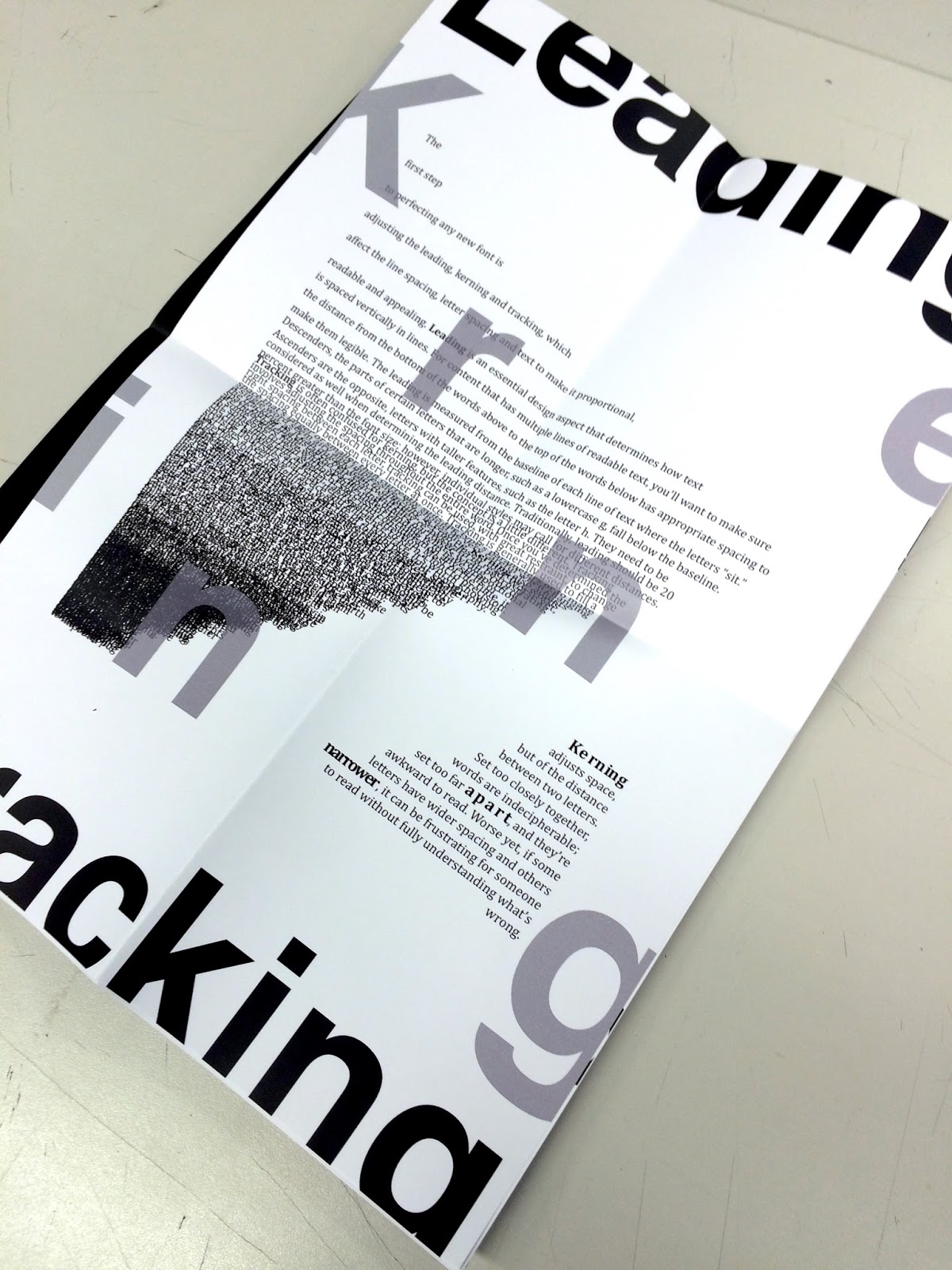
My third poster featured the difference between leading, kerning and tracking. Spatial manipulation can make a world of difference in editorial design, to create better readability and a layout that is aesthetically pleasing. I decided to simulate the different ways of manipulation on the page using the body text, and again, deconstructed the title to fit.
Finally, my last poster was on colour. I designed two different spreads for this, each featuring printing marks and CMYK colours. I think this, paired with the images used show a great example of colour.
Though I did struggle with this module, I feel it is one of my best. I created something completely different to anything I had created before, and I can't wait to finish it for Final show, and add this to my portfolio.
This is my last module before I begin my portfolio creation, and there are many aspects of all my designs that I need to tweek for that, but I think I'm going to leave this for a few weeks and come back when my head is feeling more clear. I believe that is the best way to see from a new perspective.
Process: Typography Anatomy.
Tuesday, 31 March 2015 • editorial, Process, typography, Work
For my Editorial Design Application module, titled Process, I decided to look more in depth to the process of Editorial design itself. Something I wasn't very knowledgable on was the anatomy of typography, so using this module as an excuse to learn more in depth on the aspects of Editorial, I decided to create four posters: one on grid systems, typography, leading, kerning and tracking and the use of colour.
Though I understood the terminology of type, I didn't really know the definitions of the subject. I began to research into other typography based posters on pinterest and behance.

My initial idea was to create a collage using typography, similar to above. Unfortunately, I noticed that it didn't delve into the terminology, nor the meanings and I felt this was important to show. Scrapping my initial idea, I began to research beyond this and found the website, Typography Deconstructed. This was exactly what I wanted to create: showing things such as the baseline, cap line and mean line. I came across this due to their own examples of posters on behance.

Using this as my inspiration and also finding the body copy on the website, I created my own deconstructed typography poster highlighting the different terminology.

Using my module as a way of learning and experimenting with something I really didn't understand, I feel I have a better understanding of type in general. I feel this will come into play within my next year of university and aid my annotation also. I found it extremely interesting to see how much is involved in creating typography and font faces, and the characteristics that make typefaces diverse and different.
Though I understood the terminology of type, I didn't really know the definitions of the subject. I began to research into other typography based posters on pinterest and behance.

My initial idea was to create a collage using typography, similar to above. Unfortunately, I noticed that it didn't delve into the terminology, nor the meanings and I felt this was important to show. Scrapping my initial idea, I began to research beyond this and found the website, Typography Deconstructed. This was exactly what I wanted to create: showing things such as the baseline, cap line and mean line. I came across this due to their own examples of posters on behance.

Using this as my inspiration and also finding the body copy on the website, I created my own deconstructed typography poster highlighting the different terminology.

Using my module as a way of learning and experimenting with something I really didn't understand, I feel I have a better understanding of type in general. I feel this will come into play within my next year of university and aid my annotation also. I found it extremely interesting to see how much is involved in creating typography and font faces, and the characteristics that make typefaces diverse and different.
Friday Favourites: Magazines
Friday, 2 January 2015 • editorial, Friday Favourites, Inspiration, magazines
Magazines are something I've been interested in all my life. As I child I often stole my mum's fashion magazines to pick out my favourite pages and advertisements to decorate my bedroom wall, and later, I collected issues of Company to dress up my book case. Editorial is an area of design that I'd love to go into, and with W H Smiths walls being covered in issues of all genres, there's a huge variety to choose from. Here are some of my favourite design magazines.
Computer Arts
Computer Arts describe themselves as "the worlds leading magazine for graphic designers." Available in print and digitally on iPhones / iPads, it's a magazine full of insight and inspiration. From tutorials, the work and behind the scenes of studios, interviews with other designers, and the latest trends, Computer Arts has something for all walks of designers, showcasing the best of professional advice.
Print Magazine
Print Magazine is a bimonthly magazine. It is dedicated to visual communication and design, and was founded way back in 1940 by William Edwin Rudge. Since then, it's become a valuable and established 'zine. It covers everything from publication and book design, animation, branding, exhibitions, street art and posters, offering every angle of design and trends: but what makes this magazine so special is the way it looks at design. Offering social, political and historical contents for all design, you can see how design has changed and why it matters.
Eye Magazine
Eye magazine is both beautiful and collectable. They describe themselves a journal rather than a magazine, and publish quarterly over the year. Bringing together the best design and writing, Eye magazine is for professional designers, students, and anyone interested in critical, informed journalism about design and visual culture. Eye often post "Eye before you buy" videos on Vimeo, where you can see what the collectable issues look like before you purchase. It was on their channel that I found this video, called Pureprint, where you can see the magazine through all it's processes and stages.
Computer Arts
Computer Arts describe themselves as "the worlds leading magazine for graphic designers." Available in print and digitally on iPhones / iPads, it's a magazine full of insight and inspiration. From tutorials, the work and behind the scenes of studios, interviews with other designers, and the latest trends, Computer Arts has something for all walks of designers, showcasing the best of professional advice.
Print Magazine
Print Magazine is a bimonthly magazine. It is dedicated to visual communication and design, and was founded way back in 1940 by William Edwin Rudge. Since then, it's become a valuable and established 'zine. It covers everything from publication and book design, animation, branding, exhibitions, street art and posters, offering every angle of design and trends: but what makes this magazine so special is the way it looks at design. Offering social, political and historical contents for all design, you can see how design has changed and why it matters.
Eye Magazine
Eye magazine is both beautiful and collectable. They describe themselves a journal rather than a magazine, and publish quarterly over the year. Bringing together the best design and writing, Eye magazine is for professional designers, students, and anyone interested in critical, informed journalism about design and visual culture. Eye often post "Eye before you buy" videos on Vimeo, where you can see what the collectable issues look like before you purchase. It was on their channel that I found this video, called Pureprint, where you can see the magazine through all it's processes and stages.


