I struggled, to say the least. The brief was open, left so our own interpretations could be created. "Design an editorial piece on a process. Anything from old printing techniques to a designer of your choice, create something that pushes the boundaries and shows your interests." It was difficult to decide the content, the copy, and the design all within 6 weeks.
I decided to create an editorial piece on editorial design itself. As it was what I would be researching, and something I was interested in, I thought it would be fitting to do just so. I guessed it would be easier, but I feel it made it much more difficult. It's difficult to describe and showcase the process you are currently undertaking, whilst undertaking it itself.

Despite this, I am extremely happy with what I produced. I decided to do something different: others in my class used this time to create a brochure or booklet, and because I have already done this before, I thought it fitting to try something new. I created posters.
The brief was to create 4 spreads or pages, and a cover page. I wanted my cover page to be built by the posters. Printing the posters A3 allowed me to fold them down into a4 size, and have a deconstructed cover on the front. When placing all 4 posters together, the cover is built and shows.
I think this was really dynamic and allowed the spreads to flow together. Without this tying them together, it would have felt quite disjointed and separate. They featured the title, with the word "editorial" deconstructed and collated on the page. I think this worked well with the feel of the posters and followed a similar theme. The covers alternated between white and black backgrounds, and were not truly finished when handed in: for my final show, I am going to screenprint the grey to silver, to add more dimension and a different material to the print, and contrast the matte of the paper and ink.
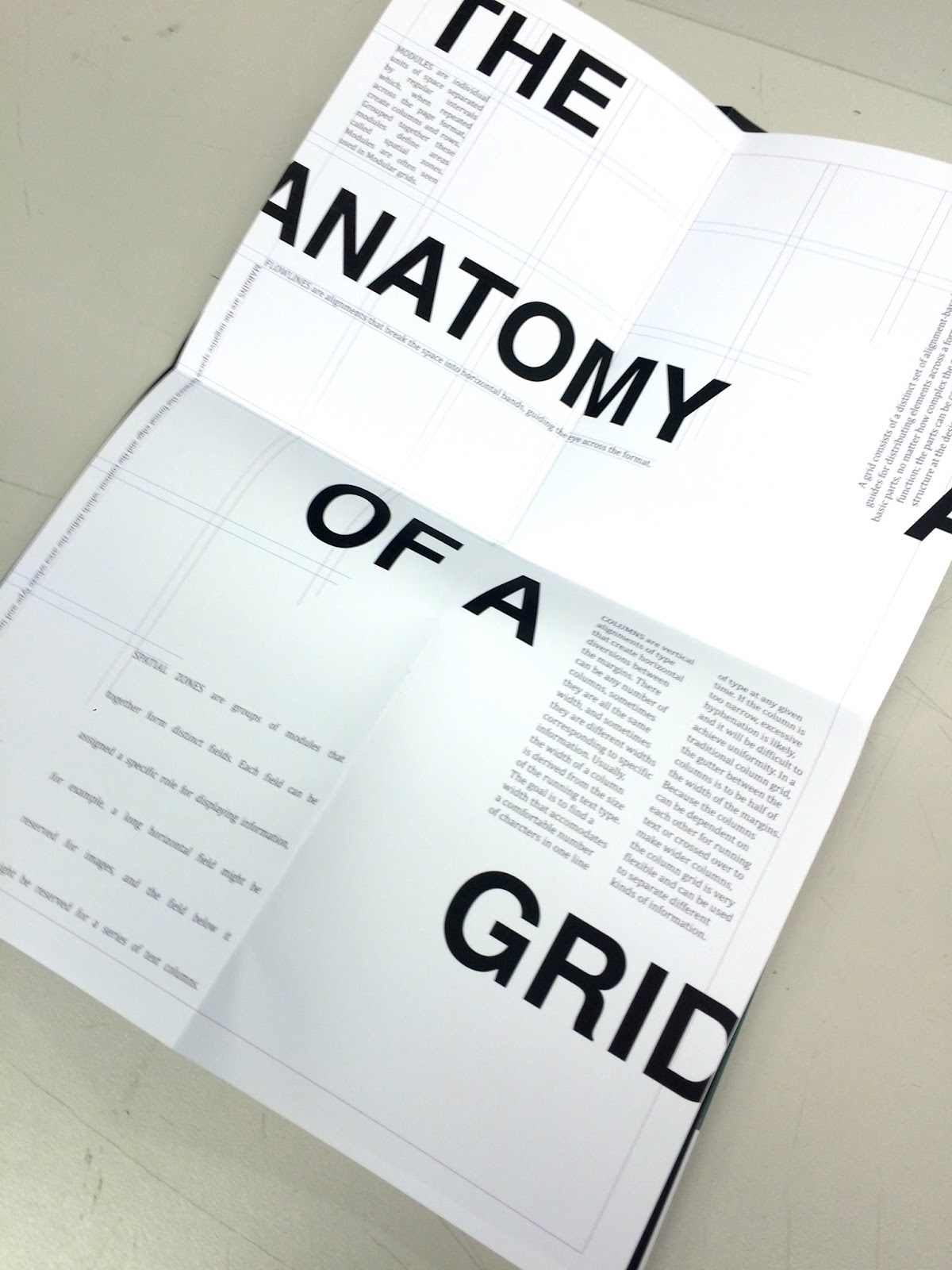
My first poster featured "the Anatomy of a Grid." I decided to imitate the grid system seen in InDesign, and focused on certain areas to showcase the different aspects that combine to create it. In my other designs, I have always used new, different fonts: within this design I wanted to feature classics, and I rekindled my love of classic typography using Helvetica Bold. I also used a similar disjointed title as seen on the cover page.

For my next poster I designed a collage of typography, featuring the different elements of type, and a breakdown of typographic terms. After printing, I have decided to also screen print the areas in colour, in silver, to tie in more with the cover page and other posters. As it's an editorial document it is important that the pages have a recurring theme and be fluid together. It needs to feel natural.
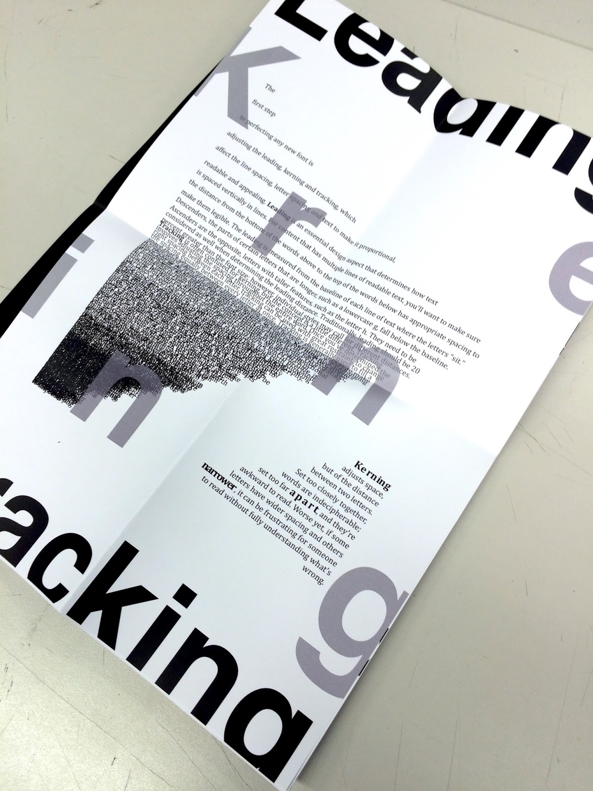
My third poster featured the difference between leading, kerning and tracking. Spatial manipulation can make a world of difference in editorial design, to create better readability and a layout that is aesthetically pleasing. I decided to simulate the different ways of manipulation on the page using the body text, and again, deconstructed the title to fit.

Finally, my last poster was on colour. I designed two different spreads for this, each featuring printing marks and CMYK colours. I think this, paired with the images used show a great example of colour.
Though I did struggle with this module, I feel it is one of my best. I created something completely different to anything I had created before, and I can't wait to finish it for Final show, and add this to my portfolio.
This is my last module before I begin my portfolio creation, and there are many aspects of all my designs that I need to tweek for that, but I think I'm going to leave this for a few weeks and come back when my head is feeling more clear. I believe that is the best way to see from a new perspective.